A digital flipbook can make a catalogue easier to share, browse, embed, and measure. It cannot repair a confusing product structure. If readers cannot tell where to begin in the source PDF, the page-turn effect simply gives them a more polished way to get lost.
That distinction matters because the viewer and the document do different jobs. The viewer controls how the file is delivered: fast loading, mobile gestures, lead capture, analytics, and a link that is easier to send than a heavy attachment. The catalogue controls what the reader understands once the first page opens.
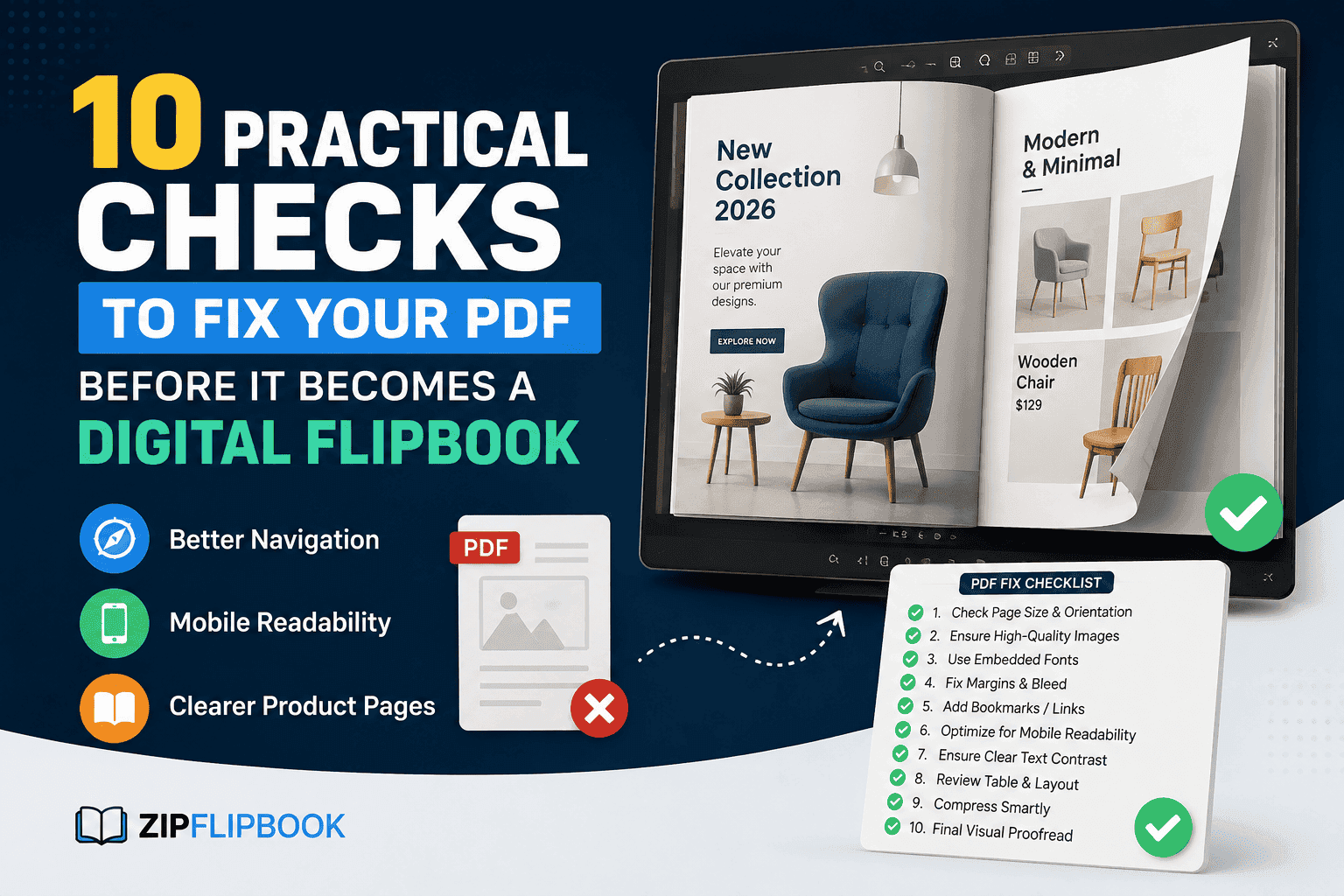
Before uploading a catalogue to a platform such as ZipFlipbook, review the actual PDF as a buying tool—not just as a design file. These ten checks catch the problems that are expensive to fix after a sales team has already shared the link.
1. Give the catalogue one audience and one job
A catalogue for a procurement manager should not behave like a lookbook for a first-time consumer. One reader needs specification depth, compatible models, and ordering codes. The other may need use cases, benefits, and reassurance. Trying to serve both audiences equally usually creates long pages with no clear reading path.
Write a one-sentence purpose before reviewing the layout: ‘This catalogue helps [reader] choose [type of product] and [request a quote, place an order, or book a conversation].’ If a page does not help that reader understand, compare, or act, it is a candidate for removal or a separate document.
2. Make the contents page sound like the buyer
Internal product families are not always meaningful outside the company. A menu built around factory codes, department names, or legacy categories forces a new buyer to learn the organisation before finding a product. Use labels based on how customers describe the problem, application, material, room, industry, or price tier.
Then make the hierarchy visible. A reader should be able to distinguish a section, subcategory, product line, and individual item without studying the page. Clear section openers and repeated category labels also help when someone lands on page 24 from a shared link instead of beginning at the cover.
3. Assign one decision to each spread
A spread does not need to contain only one product, but it should help the reader make one kind of decision. That might be choosing a category, understanding a range, comparing three models, or reviewing the details of one item. When a spread tries to introduce a brand, explain an installation process, compare products, and collect an enquiry at the same time, every element competes for attention.
Use the page title as a test. If the clearest title contains ‘and,’ the spread may be doing too much. Splitting it often improves pacing without making the catalogue feel longer, because readers can identify the purpose of each page more quickly.
4. Standardise the product-information pattern
Comparison becomes slow when one product lists dimensions beside the image, another hides them in body copy, and a third uses different units. Decide which fields appear for every item and keep their order consistent: product name, short benefit, image, key specifications, variants, code, price or quote status, and next step.
For a large range, that consistency is partly a content-architecture problem. Techfusion Gear’s catalogue design services cover product grouping, information hierarchy, comparison layouts, calls to action, and digital-ready PDF delivery—the groundwork a flipbook needs before publication.
5. Check every page at phone width
A catalogue can be technically responsive while its content remains difficult to read. Shrinking an A4 or Letter page to a phone screen may turn elegant captions into pinching-and-zooming exercises. Open the exported PDF on a real phone and check the smallest product name, specification, footnote, and button—not just the cover.
Favour fewer columns, shorter line lengths, strong contrast, and enough space around links for a thumb. Dense tables may need to become two or three smaller comparisons. The goal is not to recreate a mobile website inside a PDF; it is to preserve a readable hierarchy at the size people will actually use.
6. Make images answer a buying question
A large image earns its space when it explains finish, scale, installation, packaging, or use. Repeating near-identical hero shots across a catalogue adds weight without adding confidence. Build a simple image rule for each product type: one clean overview, one relevant detail, and one contextual image when scale or use is not obvious.
Crop consistently and avoid placing essential text inside an image. Embedded text becomes hard to read on small screens, cannot be selected, and is awkward to update. Keep names, specifications, prices, and actions as live text wherever the design allows.
7. Use comparison pages to remove options
A comparison is useful only when it helps a reader eliminate choices. Ten models across twenty attributes may look comprehensive, but it turns the buyer into a data analyst. Start with the criteria that genuinely change the purchase: capacity, compatibility, size, material, warranty, lead time, or intended use.
Group similar models and highlight the deciding difference in plain language. If technical teams need the full data sheet, link to it separately or place it in an appendix. The main catalogue should keep the route from interest to shortlist as short as possible.
8. Add navigation for readers who did not start at page one
Digital catalogues are often forwarded with a note such as ‘look at page 18.’ That reader misses the contents page and any instructions near the front. Repeated section names, restrained colour coding, descriptive page titles, and a clear return path make an isolated page understandable.
Use internal links when they reduce effort: contents entries to sections, product cards to detail pages, and detail pages back to the relevant comparison. Test every link in the exported PDF. A link that worked in the design application can still disappear or point to the wrong destination after export.
9. Place the next step beside the decision
A single ‘Contact us’ page at the end assumes readers move through the entire document. Many will stop as soon as they find a suitable item. Put the relevant action near that moment: view stock, request a specification, ask for a sample, download a data sheet, call a regional representative, or request a quote.
Make the destination specific too. A link to a generic homepage creates another search task. A product page, short form, pre-addressed email, or campaign landing page preserves the context. Add campaign parameters when appropriate so analytics can distinguish catalogue traffic from other visits.
10. Test the exported PDF, not the editable file
The final PDF is the asset the flipbook platform receives. Review that exact file from beginning to end. Check page order, crop, font substitution, image quality, file size, selectable text, bookmarks, internal links, external links, and any blank pages introduced for print production.
Ask someone who did not build the catalogue to find a specific product, compare it with an alternative, and take the intended next step. Do not explain the navigation. The pauses and wrong turns reveal more than a final spell-check ever will.
A good digital catalogue is a sequence of small decisions made easy. The source file supplies the structure; the flipbook supplies the delivery, interaction, and measurement. Treating those as separate layers produces a better result than expecting either one to compensate for the other.
Once the PDF passes these checks, upload it, test the live version again, and share the link with a small group before a full campaign. If readers can reach the right product and the right action without guidance, the catalogue is ready to do more than turn pages—it is ready to support a sale.
FAQs
How long should a digital catalogue be before it becomes hard to navigate?
There's no fixed page count. A 12-page catalogue with a confusing structure fails faster than a 60-page one with strong section labels and internal links. Length matters less than whether a reader can jump to what they need without reading in order.
Should every product have the same layout, even if some items have more specifications than others?
Keep the core fields consistent — name, image, key specs, code, next step — even if the amount of detail varies. A product with fewer specs just leaves that field blank or shorter rather than breaking the pattern. Readers compare faster when they know where to look.
Is it worth building a mobile-specific version of the catalogue, or does one PDF work for both?
One well-built PDF usually works if it's tested at phone width during the design stage, not just checked for "responsiveness" after export. A separate mobile version adds maintenance overhead most small and mid-size catalogues don't need.
What's the most common mistake that shows up after the catalogue is already live?
Broken or dead-end internal links — usually links that worked inside the design software but pointed to the wrong page or disappeared after PDF export. It's also the easiest one to catch with a five-minute click-through before sharing the link widely.
Do these checks apply to a catalogue that's already been published as a flipbook, or only before upload?
They apply either way. Running through the list on a live catalogue often turns up quick wins — a missing call to action on a popular page, or a comparison table that's grown too wide to read on mobile — without needing a full redesign.