Most software brochures get made the same way. Someone exports six screenshots from the app, drops them into a template, writes "Powerful. Scalable. Secure." across the cover and calls it finished. The sales team attaches it to emails and wonders why nobody replies.
Software is a harder sell on paper than a menu or a plumber's flyer. The product has no physical shape, and half of what makes it good happens in places a screenshot can't show. The brochure has to explain the product, make the reader believe it will work for them, and tell them what to do next. You often have under two minutes, and they're often on a phone.
This guide covers how to build a software product marketing brochure that does that. It's for founders, product marketers, and small teams without a design department. Most of it applies whether you sell SaaS, a mobile app, a developer platform, or an ERP system.
What a software product brochure is for
Before you open a template, decide what job the brochure has. There are three main jobs, and a brochure that tries to do all three does none of them well.
One job is the pre-call leave-behind. A prospect has booked a demo and you want them to arrive knowing the basics, so you don't spend twenty minutes explaining your category. Another is the post-demo follow-up, which gets forwarded to whoever missed the call, usually a finance director or IT manager skimming for price and security. The third is cold or warm outreach, sent to someone who has never heard of you and has no reason to care yet.
Each needs a different brochure. The follow-up version can be dense: integrations, compliance, a pricing summary. The cold version needs one idea on the cover and very little else. If you only have time to make one, make the follow-up version, because that's where deals are won or lost. A procurement person who can't find your SOC 2 status or pricing structure will go to a competitor who put it on page three.
Write the job at the top of a blank page before you start. "Brochure for IT managers who've seen the demo and need to justify the spend internally" is a real brief. "Brochure for our product" is not.
Choose one reader
Software usually has two audiences: the person who uses it and the person who signs off on it. A project management tool is used by team leads and bought by an operations director. The team lead wants to know whether it will stop her chasing people on Slack. The director wants the cost, who else uses it, and whether the vendor will still exist in three years.
Pick the one who decides. If that's the buyer, lead with outcomes and risk. If your product spreads bottom-up and the user effectively chooses it, lead with the day-to-day experience. The other reader can have an inside page, but the cover and the first spread belong to your main one.
Read the cover headline the way that buyer would. If their honest reaction is "so what?", rewrite it.
The structure that works
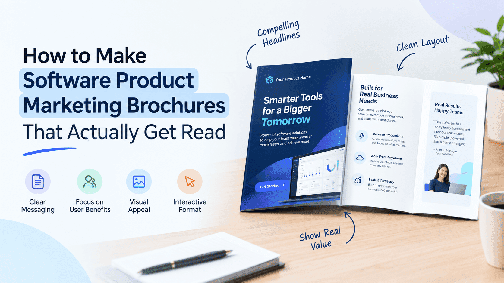
You don't need to reinvent the layout. A solid software product brochure fits on four to eight pages, or one folded sheet if you're printing. The sequence below works:
- Cover. Product name, one line saying what it does and for whom, one strong visual. No paragraphs.
- The problem. A short, specific description of the mess your reader is in today: spreadsheets, three tools duct-taped together, manual exports on Friday afternoon. Use their words.
- The solution in one view. A single annotated screenshot or a simple diagram of how the product fits into their workflow. This is the page people remember.
- Features, written as outcomes. Pick three to five. Each gets a short heading, two sentences and a visual.
- Proof. A customer quote with a name and company, a number, a logo row. One real result outweighs ten adjectives.
- Integrations and security. A logo grid for integrations and a plain statement of your security and compliance position.
- Pricing or next step. A simple pricing summary, or a clear route to getting started.
- Contact and call to action. One action, not four.
If you're short on space, merge pages 2 and 3 and fold page 6 into a sidebar. Keep the proof page. Software buyers are nervous in a way people buying a sofa aren't: switching tools is a hassle and the wrong pick is embarrassing. Proof lowers that worry more than any feature description can.
Turn Your PDFs into Lead Generation Machines
Start getting highly-qualified leads from your PDFs and landing pages today. It takes exactly 2 minutes to set up.
No credit card required • Sign up in 10 seconds
Write features as outcomes, not a spec sheet
Open most software brochures and you'll find sentences like "Advanced reporting dashboard with customizable widgets." That tells the reader what exists. It doesn't tell them why they should care.
Flip it. "See which campaigns make money without building a report" is a feature written as an outcome. The dashboard is still there; you've stopped making the reader translate.
Take each feature and ask "so what?" until you reach something a human wants: less time, less risk, more revenue, fewer awkward conversations with their boss. Write that down instead.
Use the reader's words. If customers say "client onboarding," don't write "customer lifecycle initiation." Your sales call recordings and support tickets are full of phrases worth stealing.
Cut the stacked adjectives. "Robust, scalable, enterprise-grade" appears in nearly every software brochure ever printed and registers as nothing. Swap each one for a fact. "Handles 50,000 concurrent users" says what "scalable" was hinting at.
Name the audience on the page. "For teams of 10 to 200 who are outgrowing spreadsheets" filters out the wrong readers and makes the right ones feel seen. And mix your sentence lengths. A brochure written entirely in six-word fragments reads like a robot trying to be punchy.
Screenshots: where most software brochures go wrong
Software brochures live and die on their screenshots, and most are bad. Text is too small to read once the page is scaled down. A full-screen capture gets crammed in where only one panel matters. The demo data says "Test User 1" and "Lorem ipsum project."
Crop hard. If the feature is a filter bar, show the filter bar, big. Add a short callout with an arrow instead of expecting the reader to hunt through a busy interface. Use realistic data: believable names, plausible numbers, a sensible date range. Strip out the browser chrome, notification badges and any real customer information that slipped through.
For mobile apps, show the phone in context only if you can do it without looking like stock photography. Otherwise a clean device frame is fine. Skip the fan of six phones in a row; nobody learns anything from it.
If the product is hard to picture, like an API or a backend service, draw the architecture. Four boxes and labeled arrows will out-communicate three paragraphs. Developers in particular tend to trust a diagram more than a hero image of a laptop.
Design choices that make a software brochure look credible
You don't need an agency; you need restraint. Pick two typefaces, one for headings and one for body text, and set the body at a size you can read on a phone without zooming. Use your brand colors, but let white space do most of the work. Dense brochures read as desperate.
Keep a consistent grid. If every page has its heading in a different spot, the whole thing looks assembled by committee. Most template tools handle this for you, which is a good reason to start from a decent template rather than a blank canvas. Canva, Word and InDesign all work. The tool matters less than the structure underneath it.
Contrast matters, too. A lot of SaaS brands use pale grey text on white because it looks modern on a monitor. Printed, or viewed on a phone in sunlight, it vanishes. Check it on the worst screen you own.
Should you include pricing?
Pricing is the argument that never ends. Some teams hide it because they want people on a call. Others publish it because buyers get irritated when they can't find it.
If your price is simple, put it in. If it depends on seats, usage or a custom contract, give a starting point or a range, like "Plans from $29 per user per month, with discounts on annual contracts," and say what drives the final number. A vague "contact us" on a brochure that has already been through a demo makes the buyer do extra work.
If you can't show pricing, show something that helps them budget: typical customer size, typical implementation time, what onboarding includes. A finance person needs enough to start building a number in their head.
Print, PDF or digital?
Software brochures used to be printed for trade shows and left on tables. Some still are, and a physical copy works at a conference booth if you keep it to one folded sheet and add a QR code that leads somewhere useful.
Nearly everything else goes out as a PDF, and PDFs have problems. The file is 15 MB and bounces off a corporate mail filter. You can't tell whether anyone opened it. Links inside are often broken or ignored. And whoever receives the forward sees last year's pricing, forever.
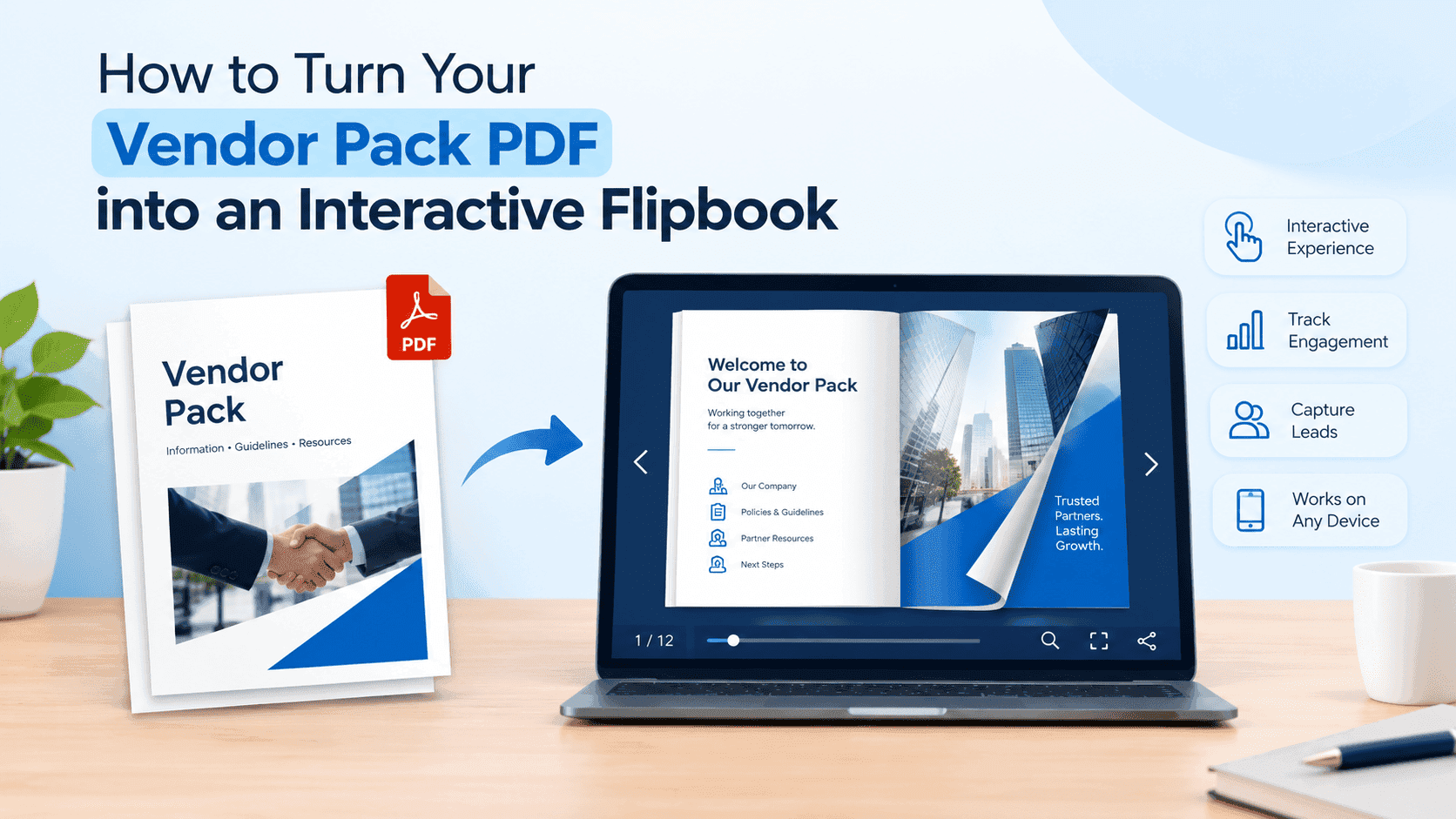
A digital brochure solves most of that. You upload the file once, and the reader gets a page-turning version that opens in the browser on any device, with clickable links, embedded video and nothing to download. You can update it later without resending anything, because the link stays the same. If you haven't made one, how to turn any PDF into an interactive digital brochure walks through the steps, and it takes less time than most people expect.
For software specifically, embedded video matters. A 45-second walkthrough sitting next to the feature it explains does more than three paragraphs of copy, and a static PDF can't hold it.
Put a lead capture in front of it
If the brochure is useful, you should know who's reading it. The easiest way is a short form before it opens: name and work email, nothing else. Every extra field cuts completion, and two fields get filled in far more often than six.
Think about when you use it. If you're sending the brochure to someone already in your pipeline, a gate is pointless and mildly insulting. If you're posting it on your website or in a LinkedIn post to people you don't know, a light form turns a download into a contact. Our post on how to turn your PDF quote or brochure into a lead generation machine covers the mechanics, including when to gate and when to leave things open.
The email you collect is worth more if you know what the person did with the brochure. That leads to measurement.
Track what people read
When a prospect says "I got your brochure," you usually have no idea whether they spent four minutes on the pricing page or closed it after the cover. That's a strange thing to be blind to after the effort you put into the document.
With a digital brochure you can see opens, time spent and which pages got attention. If most readers drop off at page three, page three is the problem and you can fix it. If pricing gets twice the attention of anything else, the next version should answer it sooner. Sales teams also like seeing that a prospect reopened the brochure on Tuesday night, because that's a decent moment to follow up. For the technical side, see how to track PDF opens for free.
Treat each version as a test. Change the cover headline, compare the drop-off, change it again. After a few months you have something shaped by reader behavior, not by whoever argued loudest in the review meeting.
Common mistakes in software product brochures
These show up constantly.
The brochure is about the company, not the product. Pages of "Our story" and "Our values" before the reader learns what the software does. Nobody cares yet. Move it to the back.
It tries to cover every feature. Most software has dozens. Pick the handful that matter to this reader and send the rest to your website or docs. Anything you cut can live in a feature comparison sheet for the person who asks.
It goes stale quietly. The screenshots show the old interface, a pricing tier has been renamed, a customer logo belongs to a company that churned. Put a quarterly reminder in the calendar to check it. A hosted digital version helps here, since fixing a typo takes five minutes and needs no new email blast.
There's no clear next step. A brochure that ends on a logo and a generic address wastes the reader's attention. Say what to do: book a demo, start a free trial, reply to this email.
It only works on desktop. A lot of people will open your brochure on a phone, often from a forwarded link on a train. If they have to pinch and zoom, they won't.
How to get it done in a day
If you're starting from nothing, this order works. Spend an hour on the brief: reader, job, one-sentence promise. Spend another hour pulling raw material: the best customer quotes, your clearest screenshots, real pricing and the integration list. Write the copy in a plain document before touching a design tool, because layout hides weak writing. Then drop it into a template, apply your brand colors and fonts, and export a PDF.
Show it to someone outside your company and ask what the product does after thirty seconds. If they get it wrong, the cover or the problem page needs rewriting. Once that works, turn the PDF into a shareable digital version, add a lead form if the use case suits one, and send it to a handful of real prospects before it goes to the whole sales team.
You'll probably want to change things after the first batch of responses. The first version of a software brochure is rarely the best one.
Turn Your PDFs into Lead Generation Machines
Start getting highly-qualified leads from your PDFs and landing pages today. It takes exactly 2 minutes to set up.
No credit card required • Sign up in 10 seconds
Frequently asked questions
What should a software product brochure include? A cover that states what the product does and for whom, the problem, a screenshot of the product in use, three to five outcome-led features, customer proof, integrations, security details and one next step.
How long should a software brochure be? Four to eight pages. A cold outreach version works at two. A post-demo follow-up for a product with SOC 2 and ten integrations usually needs six or more. Past ten pages you've written a whitepaper.
What's the best software for making a product brochure? Canva for a quick build, Word if you already live in it, InDesign if you need tight control. Whichever you pick, publish the result as a digital brochure so you can see who reads it.
Should I use a template for a SaaS brochure? Yes, if you have no designer. Choose one with a clean grid and plenty of white space, then replace every piece of stock content with your own screenshots and copy.
Is a PDF or a digital brochure better for software marketing? Digital for almost everything. You get clickable links, embedded video, easy updates and read tracking. Keep a PDF for print and for buyers whose email setup demands an attachment.
How do I make a software brochure mobile friendly? Use a single column, large body text and screenshots cropped to one feature. Publish it as a browser-based flipbook so it resizes on a phone, rather than a fixed-size PDF.
Send the first draft to five people and fix the page they stumble on.