Last month a property agent in Leeds called me pretty annoyed. Her brochure looked like a smashed PDF on her client's iPad, and she was half-blaming me for it before I'd even gotten a look at what happened. Turned out she wasn't on ZipFlipbook at the time — she was using a competitor tool that exported a desktop version and a separate "mobile-optimized" version, and she'd sent her client the wrong link. Two files, two URLs, no obvious way to tell them apart from the filename. She'd been running this setup for eight months before it bit her.
That's not a one-off story. It's the default state of interactive brochure software, and hardly anyone questions it because everyone assumes "responsive" got solved years ago. It didn't, not for this category. Most flipbook and digital catalog tools still treat desktop as the real experience and tablet or phone as something bolted on afterward, which means you either maintain two versions of the same document or accept that your brochure looks cramped, weirdly cropped, or flat-out unreadable the second someone opens it on anything other than a 15-inch screen.
Why "just export twice" isn't a real solution
The instinct makes sense on paper. Desktop gets a wide-format PDF with a two-page spread simulating an open book. Mobile gets a single-column, vertically scrolling version because nobody wants to pinch-zoom into a spread on a six-inch screen. So you export both, upload both, and now you're maintaining parallel content by hand.
That system breaks the second you have to change a price. I watched this happen to a wholesale client running a forty-page seasonal catalog — she updated a supplier's minimum order quantity in the desktop version, forgot the mobile version existed as a separate file, and spent three weeks showing two different numbers to two different sets of customers depending on which link they'd clicked. Nobody caught it until a customer forwarded both links to her sales rep and asked, reasonably, which one was correct.
That's the real cost here. Not that mobile users get a slightly worse experience, though they often do, but that you've turned yourself into a version control administrator for a marketing document. Nobody starts a brochure business, or a wedding photography business, or a supermarket, wanting to spend their Tuesday reconciling two PDFs.
Turn Your PDFs into Lead Generation Machines
Start getting highly-qualified leads from your PDFs and landing pages today. It takes exactly 2 minutes to set up.
No credit card required • Sign up in 10 seconds
What "works everywhere" should actually mean
A brochure that works across devices isn't one that looks identical on every screen. That's not the goal, and it shouldn't be. A two-page spread makes sense on a laptop because you've got the horizontal room to simulate flipping through a real book. Squeeze that same layout onto a phone and you get two half-width columns nobody can read without zooming — which is roughly the failure mode that gets a brochure abandoned in the first four seconds.
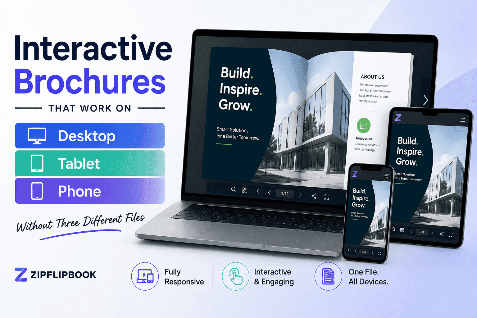
What you want is one source file that adapts its presentation to whatever's opening it, without you touching anything. Upload the PDF once. On a laptop it renders as the familiar spread with a page-curl or slide transition. On a tablet, depending on orientation, it shows either the spread or a single page, switching cleanly if someone rotates the device mid-read. On a phone it drops into a vertical single-page flow that's actually legible, but it's still the same document — same link, same embedded video or contact form, same click tracking underneath it.
It's dead simple, when you strip away the marketing language: is the tool just squishing your PDF down to fit the screen, or is it actually rebuilding the layout for whoever's holding it? The lazy version — and I'll say this bluntly because I've built both approaches at different points — scales the same fixed-size render down and calls it responsive. It technically fits the screen. It's still unreadable, because you've shrunk eleven-point body text to something closer to six-point on a 375-pixel-wide phone.
What changes when you get this right
A property brochure I rebuilt for a client in ZipFlipbook went from an 11% mobile bounce rate to something closer to 4% after we switched from a fixed-spread export to a properly adaptive one. Nothing about the content changed — same photos, same floor plans, same copy. People on phones, who made up 58% of the traffic on that particular link, could suddenly read it without giving up halfway down page one.
Your analytics stop lying to you too. Run two separate files and your click tracking, time-on-page, and lead capture data get split across two documents you then have to reconcile by hand if you want a real picture of performance. One file means one dataset. You can see that desktop viewers are spending ninety seconds on a page and mobile viewers are spending twelve, which tells you something worth acting on — rather than just confirming that mobile users exist and behave differently, which you already knew.
Embedded elements matter here too. A video walkthrough on page six of a property brochure, or a contact form for lead capture, needs to work the same regardless of device. I've seen embedded videos play fine on desktop and simply refuse to load on iOS Safari because of autoplay restrictions nobody accounted for. That's not strictly a brochure problem, but it's exactly the kind of thing that only surfaces once you're testing one real document across real devices instead of trusting your desktop preview.
Tablets are the weird middle child in most of this, and they get ignored constantly. A tablet in landscape has enough width for a proper two-page spread, but the same tablet held in portrait is closer to a phone experience, minus the cramped scale. I've had clients whose brochures looked great on an iPad Pro in landscape and then looked off the second someone flipped it upright to read one-handed on the sofa — which, if you've watched anyone actually browse a catalog on a tablet, is how most people hold the thing half the time anyway. A wedding photography client of mine had engaged couples reviewing her portfolio almost entirely on tablets, sitting together on a couch, which is a specific and common use case that a lot of brochure tools simply don't design for because it's neither the desktop case nor the on-the-go phone case.
Also read: How to convert PDF to digital brochure
Turn Your PDFs into Lead Generation Machines
Start getting highly-qualified leads from your PDFs and landing pages today. It takes exactly 2 minutes to set up.
No credit card required • Sign up in 10 seconds
The test worth running before you trust any tool
Before committing to a platform for your next catalog or brochure, do this: build one test document, upload it once, and open the link on your own phone — not a browser resize simulation, the actual phone in your hand, on mobile data if you can manage it. Then hand it to someone with a tablet and watch what happens when they rotate it mid-scroll. If either experience requires a second exported file, or the layout breaks instead of adapting, you've found the limitation before your customers do.
This exact failure is why I built ZipFlipbook the way I did. I got sick of watching small business owners waste hours babysitting duplicate files that were supposed to be the same document. Upload once, send the link, forget about it — which is how this should have worked from the start.
Not every brochure needs to survive all three device types equally well. An internal sales deck two people are emailing between their own laptops doesn't need to obsess over phone rendering. But the moment a brochure is meant to be shared outside your building — embedded on a website, texted to a customer, posted anywhere someone might open it from their pocket rather than their desk — cross-device reliability stops being optional and becomes the difference between someone reading your catalog and someone closing the tab because page four didn't load right.
Retail catalogs, property listings, wedding portfolios, restaurant menus — anything aimed at a consumer audience is going to pull the majority of its traffic from phones, often well over half. A brochure tool that treats phone as the secondary case is optimizing for the smaller slice of your actual audience. That's backwards, and it's fixable, provided whatever you're using was built around that assumption from day one instead of patched on after the fact.
None of this means you need to learn anything about breakpoints or media queries yourself. You're not the one writing the code that makes a page reflow — you're just the person who has to notice when it doesn't. So check for adaptive rendering rather than fixed-image scaling before you commit to a tool, test on the actual devices your customers use, and resist the urge to patch a bad mobile experience by exporting a second file. That patch creates a bigger problem than the one it fixes, because now you own two documents that are supposed to say the same thing and eventually won't.
The Leeds agent, for what it's worth, switched over afterward. Not because of some big pitch from me — she just wanted to stop maintaining two files and hoping she remembered which one to send. That's most of what this comes down to. One link, one document, tested on the phone in your actual pocket before you send it to a client, not just previewed on the laptop where you built it.