I got handed an iPad at a trade show in Manchester a few years back, before ZipFlipbook was even a line of code, and watched a rep from some kitchen fitting company try to show me their catalogue on it. The PDF was zoomed in wrong. He kept pinching and dragging, apologising, pinching again. By the time he found the page with the worktop finishes I'd already decided I didn't need a new kitchen. That memory has stuck with me longer than it probably should have, mostly because I now spend an unreasonable amount of my life thinking about exactly this problem: how content behaves on a tablet screen when someone's trying to sell something.
So when people ask me about interactive brochures on iPad, I don't come at it from a design blog angle. I come at it from having watched dozens of businesses get this wrong in almost identical ways, and a smaller number get it embarrassingly right.
The iPad is not a small laptop
This is the bit everyone skips past. An iPad in someone's hands at a showroom, on a sales call, at a wedding fair, whatever, is being held differently than a laptop, touched differently, and looked at from a different distance. Standard PDFs were built assuming a mouse and monitor. Put that same PDF on an iPad and you inherit all the friction: text too small to read without zooming, links that don't register properly on tap, layouts that assume infinite scroll space that isn't actually infinite.
I've had client calls where the entire first ten minutes were spent troubleshooting why a PDF brochure "looked broken" on someone's iPad, and it wasn't broken exactly, it was just never designed for touch. There's a difference between a document that's viewable on a tablet and one that's actually built for it. Most brochures fall into the first category by accident and call it done.
What "interactive" actually needs to mean
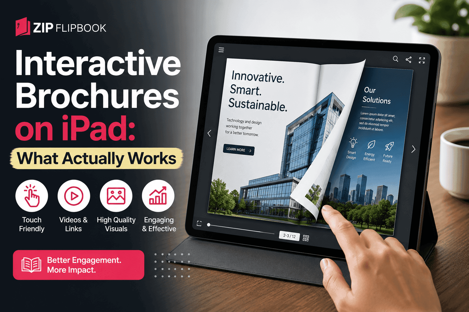
Everyone throws the word interactive around without saying what they mean by it, so let me be specific, because vague words let people off the hook for doing the actual work. An interactive brochure on an iPad should let someone flip through it the way they'd flip a real book – with their thumb, not a scroll bar. Embedded video should play inline without launching a separate app that yanks them out of the experience. A tap on a product photo should take them somewhere useful, a form, a shop page, a phone number, rather than doing nothing because the PDF was flattened and every hyperlink died in the export.
The flipping bit sounds trivial. It isn't. There's something about the page-turn gesture that makes a brochure feel like a brochure and not a document. I've watched people on stands at exhibitions physically relax when they realise they can swipe instead of scroll, like their hands already knew what to do and were just waiting for the software to catch up. It's a small thing that changes the whole feel of a sales conversation.
Where most businesses actually go wrong
Let me be specific, because generalities are useless. The most common failure I see is exporting straight from InDesign or Canva to PDF and calling that the interactive brochure. It isn't. It's a static document wearing an interactive brochure's coat. No page flip animation, no click tracking, no way of knowing if the person on the other end even opened past page three. A print designer hands over the PDF, someone uploads it to the website, and everyone moves on assuming the job's done.
Second most common mistake is going the opposite direction and building something so heavy with embedded video and animation that it takes fifteen seconds to load on a 4G connection at a trade show where the wifi is being shared by four hundred exhibitors. I've seen this happen. A brochure that looked stunning on the studio wifi during development turned into a spinning wheel of shame the moment it hit a real showroom floor. Nobody waits fifteen seconds for a brochure. They just don't.
Third, and this one's more forgivable because it's less obvious: brochures that work fine on iPad but don't leave any trace behind. Someone flips through the whole thing, genuinely interested, closes it, and the salesperson has no idea it happened. No lead captured, no email, no signal that this prospect spent four minutes lingering on the pricing page. That's not a technical failure, that's a missed opportunity sitting right there in the data nobody bothered to collect.
The bit nobody talks about: file size and load time
I bang on about this more than people probably want, but it matters enormously for iPad. Tablets at trade shows and showrooms are often on shared, congested wifi, or worse, tethered to someone's phone because the venue wifi died an hour into the event. A brochure built with huge unoptimised images is going to choke exactly when you need it most, in front of a potential customer, with them watching you wait.
Good interactive brochure tools compress images intelligently on upload rather than dumping the raw file straight through. It's not glamorous work, nobody's going to compliment you on your image compression, but it's the difference between a brochure that opens instantly and one that makes your sales team look unprepared. I built compression into ZipFlipbook specifically because I got tired of hearing this complaint secondhand from people using other tools, and because I've been that guy standing next to a frozen loading screen at an event.
Analytics actually change how you sell
Here's something that took me longer to appreciate than it should have. Once you can see which pages people actually spend time on inside a brochure, you start noticing patterns you'd never guess at from a boardroom. A client of mine in the wedding photography space assumed everyone cared most about the album page. Turned out the pricing page and a specific gallery of outdoor shots were where people lingered longest, and the album page barely got a glance. That's not a small insight. That reshapes the whole sales conversation, because now the sales team knows to lead with pricing transparency rather than album craftsmanship, which nobody had asked them to change but the data told them to.
This is the argument I make to anyone still on the fence about ditching flat PDFs. It's not really about the flipping animation, nice as that is. It's that a proper interactive brochure tells you something a printed one physically cannot. Every page turn, every tap, every drop-off point becomes information you can act on. I'm biased here, obviously, this is a large part of why ZipFlipbook exists, but the bias comes from having built the thing after watching businesses fly blind for years with brochures they'd spent thousands designing and zero pounds measuring.
Turn Your PDFs into Lead Generation Machines
Start getting highly-qualified leads from your PDFs and landing pages today. It takes exactly 2 minutes to set up.
No credit card required • Sign up in 10 seconds
Lead capture without wrecking the experience
There's a wrong way to do this too, and I've seen it enough times to have opinions. Slapping a lock screen over the first page that demands an email address before anyone's even seen the brochure kills more conversions than it creates. People on an iPad at a showroom, mid-conversation with a salesperson, are not going to fill out a form to see page two of something they haven't even glanced at yet.
What works better, and what I pushed for when we built this into ZipFlipbook, is letting someone browse freely and capturing the lead at a natural point, after they've engaged, on their way out, or when they want to save or share the brochure for later. That's the moment someone's actually invested enough to hand over an email. Gate it too early and you're just training people to bounce.
Embedding video without the app-switch problem
This one's a specific, technical annoyance but it matters a lot on iPad. If a brochure embeds a YouTube link that opens the YouTube app when tapped, you've just lost your prospect to an app full of unrelated videos, comments, and whatever algorithm decides to serve next. They might not come back. Video needs to play inline, inside the brochure itself, so the person never leaves the experience you built for them. It sounds like a minor UX detail. In practice, it's the difference between someone watching your product demo and someone watching a cat video twelve minutes later because YouTube suggested it.
Turn Your PDFs into Lead Generation Machines
Start getting highly-qualified leads from your PDFs and landing pages today. It takes exactly 2 minutes to set up.
No credit card required • Sign up in 10 seconds
What I'd actually tell someone starting from scratch
If you're building an interactive brochure for iPad use and you're starting from a plain PDF you already have, the honest answer is you don't need to redesign the whole thing from the ground up. You need a tool that takes that PDF and turns it into something that behaves properly on a touchscreen: page-turn navigation, compressed and fast-loading images, embedded media that plays where it sits, tap-through links that actually work, and some way of seeing what happens after you hand the iPad over. That's the whole list. Everything else is decoration.
I'll say the obvious thing plainly since there's no point dancing around it: this is more or less what ZipFlipbook was built to do, and it's free to use, which matters because I built it after getting frustrated with tools that charged a monthly fee to do something that shouldn't require one. You upload the PDF, it becomes a flippable, shareable, embeddable brochure with analytics attached, and you don't need a design team or a developer to make it happen. Whether you use us or something else, the checklist above is the one that actually matters, because I've watched enough brochures fail on iPad screens to know which details are cosmetic and which ones cost you the sale.
The kitchen fitting guy from that trade show years ago probably still has that same PDF, still zoomed in wrong, still losing him conversations he doesn't know he's losing. That's why any of this is worth writing about.