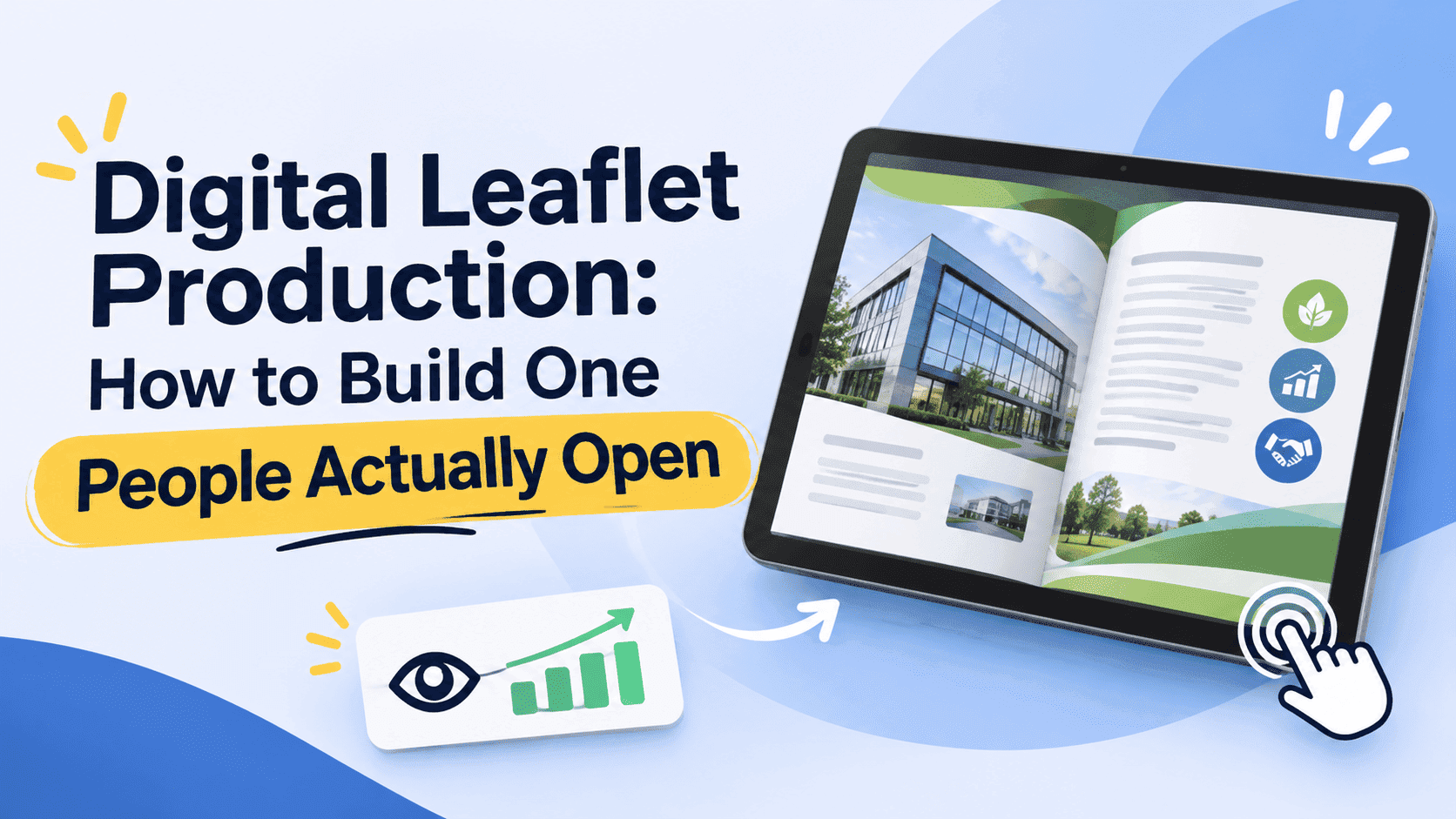
A printed leaflet has one job and a very short life. It lands on a doormat, gets a three-second look, and goes in the recycling or on the fridge. Digital leaflet production is the same job by a different route. Most people I see just export the print PDF and email it, then wonder why nobody reads it. That's where it falls apart.
I run an SEO agency for tradespeople and small businesses, so a fair number of leaflets cross my screen. Most of them were designed for print, signed off for print, and then pushed online with no changes. They open as a tiny page on a phone, the text needs pinching to read, the phone number isn't tappable, and the file is 28MB because someone left the print-quality photos in. It's been moved online, but it hasn't been made for the screen.
This post walks through how I'd produce a digital leaflet from scratch: planning, sizing, writing, images, links, conversion, sharing and measuring. If you're still sorting out what the format even is, our explainer on what a digital leaflet is covers the basics, so I'll skip the definitions here.
Decide what the leaflet is for before you open a design tool
If you give me four actions, I'll pick none. Pick one action you want the reader to take. Book a quote, claim an offer, join a mailing list, visit a stall on Saturday. Everything else on the page either supports that action or goes.
A printed leaflet gets held, turned over, and glanced at for however long the person feels like. Online it's worse: they're in a queue, not holding your leaflet, and it got opened between two other things. You have maybe the first screen to make the point.
Write the single action as a sentence before you design anything. "Get a free boiler quote before the end of November" is a brief. "Tell people about our services" is not, and it produces the sort of leaflet that lists everything the company does in eight-point type.
Also decide how it will travel. A leaflet that mostly gets sent over WhatsApp has different needs from one embedded on a landing page or handed out with a QR code on a van door. WhatsApp and email favour small files and a strong first page. A website embed can afford more pages and more media. If it will do all three, design for the strictest one, which is the phone.
Page size, orientation and why landscape often fails
Print leaflets come in A4, A5, DL and the folded variants, and those sizes were chosen for pockets and letterboxes. Screens don't care about letterboxes.
For a digital leaflet that will mostly be read on phones, portrait wins. A landscape A4 page shrunk to fit a phone screen leaves you reading text that is maybe 5 or 6 points tall. Portrait A5, or something close to a 4:5 ratio, fills far more of the screen and keeps the type legible without zooming.
If your design is a trifold, treat each panel as its own page rather than showing the flat six-panel spread. A flat trifold on a phone is unreadable. Split it into six portrait pages in the order a person would read them, with the cover first and the call to action last. A flipbook reader handles that sequencing well, and a static PDF doesn't.
Bleed marks and crop marks should come off before export. They look sloppy on screen, and I've seen leaflets go live with registration marks still visible in the margins, which does nothing for credibility.
Write for a thumb, not a doormat
Print copy can lean on layout tricks. A big headline, a photo, a short list, a boxed price. Digital copy has to survive being read in a hurry on a small screen, so a few things change.
Shorten the headline. Anything past about eight words wraps to three lines on a phone and swallows the first page. Put the offer or the benefit in it, not the company name, since the cover will usually carry the logo anyway.
Cut body copy harder than feels comfortable. If a paragraph on the printed version ran to five lines, aim for two. Readers on phones skim, and dense blocks of small text read as homework. This is where a lot of tradesperson leaflets lose people: a column of every service they offer, from guttering to fascias to soffits, when a single line saying "roofline repairs, quotes in 24 hours" would do the same work.
Make the next step obvious on every page, or at least on the first and last. A phone number written in a font size that needs a magnifying glass is a missed call. We'll get to making it tappable in a moment.
Proof it on a real phone. Not a browser window resized to look like one. Pick up your phone, open the file, and see whether you can read it at arm's length. If you have to squint, so will they.
Images: the quickest way to ruin a leaflet's load time
Print needs 300 dpi images. A screen doesn't. A photo at 150 to 200 pixels per inch at its displayed size looks sharp on any phone and weighs a fraction as much.
This is where the 28MB leaflet comes from. Eight full-bleed photos at print resolution, a few transparent PNG logos, and nobody ran the file through compression. On a decent broadband connection that takes a few seconds. On a patchy 4G signal in a van park or a client's driveway, it can time out before the first page appears.
A sensible target is under 5MB for a short leaflet and under 10MB for a longer one with plenty of photography. Export JPEGs rather than PNGs for photos, keep PNGs for logos and flat graphics, and run the finished PDF through a compressor before conversion. If you've got an especially heavy file, the principles in our post on optimizing large PDFs for fast online flipbooks apply just as much to a leaflet as to a 120-page catalogue.
One trap worth mentioning: text baked into images. If your offer is a graphic with the words burned in, it can't be searched, can't be read aloud by a screen reader, and can't be copied. Keep real text as live text wherever you can, and save images for pictures.
Make the useful things clickable
The clickable stuff is the whole point, and most leaflets waste it.
A phone number should be a tap-to-call link. An email address should open a new message. A website address should go to the specific page that matches the leaflet, not your homepage. If the leaflet is about a boiler offer, the link goes to the boiler offer page. People who land on a generic homepage have to start searching again, and many don't.
Use a button, not a blue underlined URL. A rectangle that says "Book a free quote" in a contrasting colour gets pressed more often and is easier to hit with a thumb. Make it at least the size of a fingertip, with some air around it so people don't hit the wrong thing.
Video is worth adding when it saves you words. A thirty-second clip of a finished bathroom does more than a paragraph about your tiling. Embedded media tends to work best when it starts on a tap and not on its own, since autoplaying audio on a leaflet someone opened in a meeting is a quick way to get it closed.
If you want a fuller shopping list of what to add and what to leave off, the post on interactive elements every digital leaflet needs goes through the list in more detail. I'd add one rule of my own: if a button or video doesn't help the one action, cut it. A leaflet with seven buttons, two videos and a pop-up form feels like a website that lost its way.
Turn Your PDFs into Lead Generation Machines
Start getting highly-qualified leads from your PDFs and landing pages today. It takes exactly 2 minutes to set up.
No credit card required • Sign up in 10 seconds
Converting the file into a leaflet people can flip through
After that, conversion takes about ten minutes. A plain PDF is fine for printing and filing, but it's a poor reading experience on a phone: no page turn, no tracking, no capture of who opened it, and a download prompt that some people simply refuse to tap.
Turning that same file into a flipbook gives you a shareable link and an embeddable version, and the pages turn the way a leaflet is meant to. With ZipFlipbook you upload the PDF, and it builds the browser version without you touching code. You can add lead capture if you want a name and email before the third page, embed video, and see afterwards how many people opened it and where they stopped. That last part is what I'd have wanted years ago when I was guessing whether a printed run had done anything.
A word on lead capture, since it's easy to overdo. Putting a form on page one stops most people cold. If the leaflet is a straight offer, leave it open and put the form on the last page or behind a second-level resource such as a price guide. If the leaflet is the thing itself, like a buyer's guide, a gate after a couple of pages is reasonable. Test both. If you want the longer argument on collecting contacts, how to create an interactive digital leaflet that captures leads is the one to read.
There are plenty of platforms that do this kind of conversion, and they differ on free limits, watermarks and branding. Our comparison of digital leaflet platforms sets them out if you're choosing, so I won't repeat the table here.
Getting it in front of people
Exporting isn't distribution. If it just sits in a folder, nobody sees it.
For tradespeople and local shops, the most reliable routes tend to be dull ones. A QR code on the van, the shop window, the invoice and the business card, all pointing to the same link. A link in the email signature that changes each season. A WhatsApp message to past customers with the leaflet and a one-line reason to open it. WhatsApp attachments cap out around the 30MB mark and compress badly, so a link beats a file every time.
Social media works if you make a good thumbnail. The cover page is your preview image, so design it to read at the size of a postage stamp. A bold headline and one clean image will do more than a cluttered cover.
On your own website, embed the leaflet on the page it relates to rather than hiding it in a downloads folder. A roofing page with the offer leaflet embedded beneath the service description gets looked at. A "Resources" page nobody visits does not.
If you also print, keep doing it. Digital doesn't replace a leaflet through the door in the right postcode. Put the same QR code on the printed version and you can finally see how many of those doormat drops led to a visit, which is something printing alone never told you.
Measure it and change it
You can change it after you send it. That's the useful bit. A printed run is fixed the moment it leaves the press. A digital leaflet can be edited on a Tuesday afternoon.
Look at three numbers. How many people opened it, how far they got, and how many took the action you set at the start. If most people leave on page two, the problem is on page two. If they read to the end but nobody clicks the button, the offer or the button is the problem. If hardly anyone opens it, the cover or the subject line that carried the link is at fault.
Change one thing at a time. Swap the cover headline, wait a couple of weeks, and compare. Changing five things at once tells you nothing about which one worked.
Update dates and prices. An expired offer in a leaflet that's still live is worse than no leaflet, because it tells the reader you aren't paying attention. Put a recurring reminder in your calendar, monthly for seasonal businesses.
Turn Your PDFs into Lead Generation Machines
Start getting highly-qualified leads from your PDFs and landing pages today. It takes exactly 2 minutes to set up.
No credit card required • Sign up in 10 seconds
Mistakes I see again and again
The commonest is the print file pushed online untouched: landscape A4, tiny text, enormous images, no links. The second most common mistake is a cover that gives no reason to open it. A logo and the word "Brochure" gives a reader nothing, whereas "Winter boiler service, from £69" gives them a decision to make.
Then there are dead links. Test every link and button on a phone before you share the leaflet. A dead contact link costs you leads.
Last, accessibility. Low-contrast text, missing alt text and unreadable fonts lose people who might have been customers. Aim for dark text on a plain background, text at least 16 pixels equivalent on a phone, and a logical reading order. It takes an extra twenty minutes and widens your audience.
A simple production checklist
Before you share anything, run through this once:
- One clear goal written down, with one action for the reader.
- Portrait pages, readable on a phone without zooming.
- Headline under about eight words, body copy cut in half.
- Images resized for screen, total file under 5 to 10MB.
- Phone, email and web links all tappable and tested.
- Cover designed to work as a tiny thumbnail.
- Converted to a shareable, embeddable link with open tracking on.
- QR code and link placed on at least three real-world touchpoints.
Frequently asked questions
How long should a digital leaflet be? Six pages for an offer, ten at the absolute most for a guide. Past that, split it in two.
What size should a digital leaflet be? Portrait A5, or close to 4:5. Landscape only if you know everyone reads on a desktop, and you don't.
Can I use my print PDF as the digital version? Technically yes. But resize, compress and add links first, or it'll read badly on a phone.
How do I know if the leaflet is working? Opens, how far people get, clicks on the main button. Look at them after every edit.
Turn Your PDFs into Lead Generation Machines
Start getting highly-qualified leads from your PDFs and landing pages today. It takes exactly 2 minutes to set up.
No credit card required • Sign up in 10 seconds
Where to start
Pick the leaflet you already have, the one sitting in a folder from the last print run. Open it on your phone. Whatever annoys you in the first thirty seconds is your first edit. Fix that, compress it, add one tappable button, and put it online. You can polish version two next week.