A client asked me last month why her "catalog" wasn't converting, and when she sent it over, the problem was obvious in about four seconds. It was gorgeous. Full-bleed photography, moody lighting, a model leaning against a doorway in a linen shirt. Not a single price on any page. Not one "add to cart" button anywhere. She hadn't built a catalog at all — she'd built a lookbook and called it something else.
This mix-up happens constantly, and it's not really her fault. The two formats look similar enough on the surface that most people never stop to ask which one they're actually making before they start. So let's fix that, properly, before you spend a weekend building the wrong thing.
They're not two versions of the same document
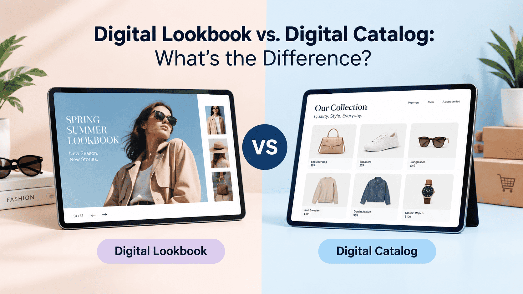
Here's a mental shortcut: a lookbook is an invitation, a catalog is a menu. You don't order off an invitation, and you don't fall in love with a menu. Different jobs, different documents, different everything downstream of that.
A digital lookbook exists to make someone want something before they know exactly what "it" is yet. Think fashion editorials, styled interiors, a hotel's seasonal brochure — pages built around mood, composition, and story. The images do almost all the work. Copy, when it appears, tends to be a single evocative line rather than a description.
A digital catalog exists to help someone who already wants something find the specific version of it, compare it to alternatives, and buy it. SKUs, sizes, prices, stock levels, filters — the entire point is efficient decision-making, not atmosphere.
Neither is "better" — they're for opposite moments in a customer's head.
Turn Your PDFs into Lead Generation Machines
Start getting highly-qualified leads from your PDFs and landing pages today. It takes exactly 2 minutes to set up.
No credit card required • Sign up in 10 seconds
A quick gut check
Not sure which one you need? Ask this: does the reader need to walk away knowing a specific price and being able to act on it immediately? If yes, you need a catalog. If the reader just needs to walk away wanting more of what you do, you need a lookbook.
Another test: imagine someone screenshots a single page from your document and shows it to a friend with zero context. If that page makes sense as a standalone photo — no price, no product name needed — it's lookbook territory. If the friend would immediately ask "wait, how much is that?" because the page implies a transaction, it's catalog territory.
Where lookbooks earn their keep
Fashion and apparel is the classic home for this format, and for good reason — clothing sells better in context than in isolation. A blazer photographed flat on a table tells you almost nothing about how it actually looks on a body, in motion, paired with something else. A lookbook solves that by showing the outfit as a complete idea.
Furniture and interiors work the same way. Nobody buys a sofa because of its dimensions first. They buy it because they saw a room that made them want their own living room to feel like that, and the sofa happened to be in it.
Boutique hospitality, events, and high-end real estate also lean lookbook, because in all three, a huge share of the purchase decision is emotional rather than spec-driven. Nobody's booking a destination wedding venue off a bullet-point list of amenities.
If you're building in this category and want to see what other brands are doing well, there's a comparison of digital lookbook tools worth trying that's worth a look before you commit to a platform, since the wrong tool can quietly strip out the polish that makes a lookbook actually work.
Where catalogs earn their keep
Wholesale and B2B sales are catalog country, full stop. A buyer working through a 300-SKU order isn't looking for inspiration — they're looking for a fast way to find item numbers, check minimum order quantities, and move on to the next line item. Slow them down with mood photography and you've made their job harder, not better.
Retail product ranges where customers compare options within a category — electronics, appliances, tools, sporting goods — also belong here. People shopping this way want three or four similar products side by side with prices visible, not one product styled beautifully with nothing to compare it against.
Distributors and reps working trade shows need something they can hand over or pull up on a tablet that answers "do you have this, and how much" in seconds. That's a catalog job, every time.
If this sounds like your business, there's a practical guide on building a shoppable digital catalog that covers the part most people get stuck on — linking individual products straight through to checkout instead of leaving the reader to go hunt for the item on your site separately.
What actually changes on the page
Let's break down the physical differences, because this is where people accidentally blend the two formats without realizing it.
How much is on each page. Lookbooks breathe. One image per page is common, sometimes two, with generous margins. Catalogs are dense on purpose — a grid of four, six, or eight products per page isn't a design failure, it's the whole point, because density is what lets someone scan quickly.
How much text there is. A lookbook page can have zero words and still do its job perfectly. A catalog page with zero words is broken, because nobody can act on a photo they can't identify or price.
How people move through it. Catalog readers jump — to a category, a specific page, a search result. Lookbook readers are meant to move front to back, because the sequence is doing narrative work, building toward something. Bolt a search bar onto a lookbook and you've turned a story into a database.
Where the "buy" moment lives. Catalogs put pricing and purchase actions directly next to each product, page after page. Lookbooks usually hold that moment back — often to a single call to action at the very end, "shop the full collection," rather than interrupting the mood every few pages with a transactional nudge.
The photography itself. Lifestyle and editorial shots for lookbooks. Clean, consistent, often plain-background product shots for catalogs. Mixing styles within one document reads as inconsistent, and readers pick up on that inconsistency even when they can't articulate why something feels off.
Turn Your PDFs into Lead Generation Machines
Start getting highly-qualified leads from your PDFs and landing pages today. It takes exactly 2 minutes to set up.
No credit card required • Sign up in 10 seconds
The hybrid approach, and why it's harder than it looks
Plenty of brands successfully combine both in a single piece — usually a short lookbook section up front, followed by a full catalog section in the back. It's a genuinely effective structure: hook the reader emotionally in the first several pages, then hand them the practical tools to actually purchase once they're sold on the vibe.
The trap? Trying to make individual pages do both jobs at once. A gorgeous lifestyle photo with six SKU numbers crammed into a corner satisfies nobody — it's not immersive enough to work as a lookbook page, and it's not scannable enough to work as a catalog page. If you're going hybrid, make the transition obvious: a section break, a shift in layout density, maybe a divider page. The reader's brain needs a cue that the document has changed modes, or the whole thing feels muddled instead of clever.
A footwear brand I worked with did this well. The first eight pages were pure lookbook — sneakers shot on models walking through a city, no prices, barely any text. Page nine was a single divider with just the words "the collection" and a change in background color. From there on, it was a straight grid: product, colorway, price, size availability. Their customers didn't seem confused by the switch at all — if anything, engagement on the catalog pages went up, because by that point people already wanted the shoes and just needed to know which size was left.
The lesson from that project wasn't really about page count or layout ratios. It was that the switch has to feel intentional. Nobody minds a document changing gears halfway through, as long as it announces that it's doing so.
Technical details that matter more than you'd think
Loading speed. Lookbooks lean heavily on large, high-resolution photography, and that file weight adds up fast — if a lookbook takes ten or fifteen seconds to open on someone's phone, most people bail before the first image even loads, no matter how striking that image would have been. Catalogs have a different version of the same problem: dozens of pages each with several product photos can bloat quickly, so compression and lazy-loading aren't optional extras, they're what makes either format actually usable.
Mobile layout. Most people will open both formats on a phone first. Lookbooks tend to translate well because full-bleed single images naturally fit a vertical screen. Catalogs are riskier — a four-column grid that looks clean on a laptop can collapse into an unreadable wall of thumbnails on mobile.
How you gate access. Both formats can require an email before granting full access, but the expectations differ. Asking for an email to "see the full collection" feels natural for a lookbook. Gating an entire catalog behind an email wall can feel heavy-handed to B2B buyers who just want the SKU list — a lighter version, gating only a price sheet or a quote request, usually works better there.
Quick answers to common questions
Can a catalog have any lifestyle photography at all? Sure — a small hero image at the top of a category page can work well, as long as the products themselves are still clearly priced and easy to scan below it. The rule isn't "no lifestyle photos ever," it's "don't let atmosphere replace information."
Does a lookbook need a table of contents? Usually not, and adding one can actually work against the format. Lookbooks are meant to be experienced in sequence, and a table of contents invites the reader to skip around, which undercuts the pacing you built the whole thing around.
Which format is cheaper to produce? Cost depends more on photography than format — neither is inherently cheaper. A catalog with existing product photos can be assembled quickly and affordably. A lookbook that relies on a proper photoshoot, styling, and a model will usually cost more up front, though it typically has a longer shelf life across seasons or campaigns.
Can the same platform build both? Yes, and honestly it should — the tool itself doesn't need to know or care which one you're making. What matters is that you make the format decision consciously before you start dropping in pages, rather than letting the default template choose for you.
Turn Your PDFs into Lead Generation Machines
Start getting highly-qualified leads from your PDFs and landing pages today. It takes exactly 2 minutes to set up.
No credit card required • Sign up in 10 seconds
The question to actually ask yourself
Skip the debate about which format sounds more impressive and just look at how your customers currently make decisions. If they need to be convinced your product is worth wanting in the first place, that's a lookbook problem. If they already want what you sell and just need the fastest possible path to ordering it, that's a catalog problem.
Most businesses need both, just at different points in the funnel — a lookbook to build desire, a catalog to convert it. What doesn't work? Asking one document to do both jobs, which is how you end up with something that's neither inspiring enough to move someone emotionally nor practical enough to close a sale. Pick the job first. The format follows from there, not the other way around.