A few months ago a friend who sells handmade ceramics asked me why her PDF catalog "just sits there." She'd spent a weekend photographing every mug and bowl, laid it all out nicely in InDesign, exported a clean PDF, emailed it to her mailing list — and got exactly two replies. Both from people asking if she still made the blue glaze.
A static catalog is just a brochure — it shows products but doesn't sell them. People look, maybe they like what they see, and then they close the tab and go find the item somewhere they can actually buy it — usually not from you. A shoppable digital catalog fixes that specific problem: it turns "here's what we sell" into "here's what we sell, and here's the button to buy it," without making the buyer leave the page they're already looking at.
This isn't niche anymore. If you sell physical products and you're still relying on a PDF, you've probably noticed people don't buy from it the way they used to. Below is what actually goes into building one, the mistakes that sink otherwise good catalogs, and how to do it without touching a line of code.
What "Shoppable" Actually Means
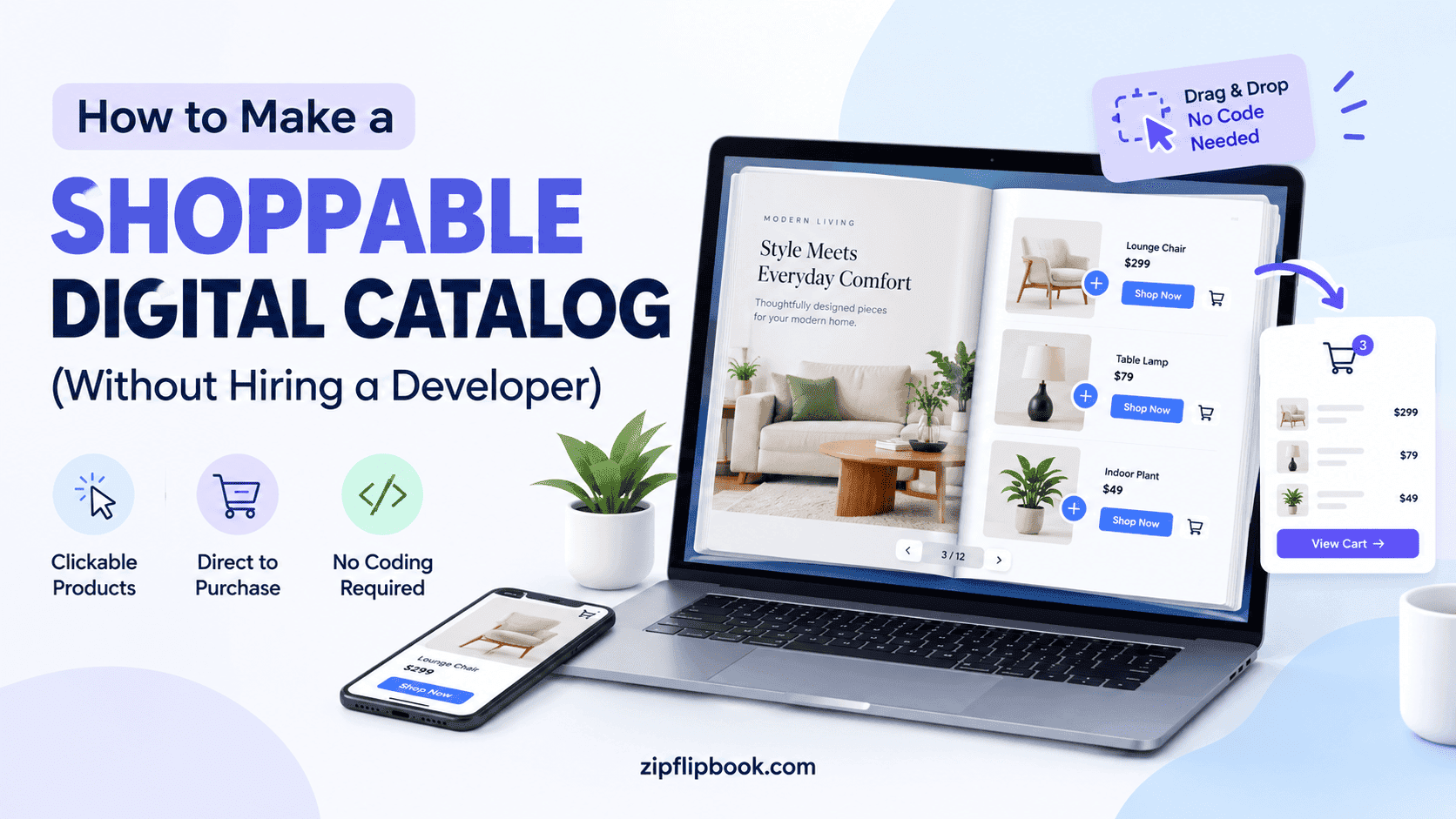
Let's be clear about what "shoppable" actually means, because the term gets thrown around loosely. A shoppable catalog isn't just a PDF with hyperlinks bolted onto it (though that's a start). It's a browsing experience where:
Every product image or listing has a direct, obvious path to purchase — a button, a tappable hotspot, a linked price tag.
The catalog tracks what people click, so you know which page 14 got ignored and which page 3 got hammered.
It works the same whether someone opens it on a laptop at a desk or on a phone in a waiting room, without pinch-zooming into oblivion.
It doesn't require the buyer to download anything, install a viewer, or create an account just to browse.
If your "catalog" fails more than one of those, it's a brochure with ambitions. Nothing wrong with that, but don't expect it to sell.
Step One: Get the Product Data in Order Before You Design Anything
The instinct is to open a design tool first. Resist it. The catalog is only as good as the product information behind it, and cleaning that up after the fact is miserable. For each item you're including, you want:
A final product name (not the internal SKU code you use with your supplier).
One or two clean photos — a hero shot and, ideally, a detail or lifestyle shot.
A price, or a "starting from" if it varies.
A link to where that specific product can be bought — its actual product page, not your homepage.
A one-line description that answers the one question a buyer would ask if they had you in the room.
If you're working from a spreadsheet or a Shopify/WooCommerce export, this is the point to strip it down to just those fields. Trying to cram in every attribute — dimensions, weight, material composition, three variants — into a catalog page is how you end up with a page that reads like a shipping manifest.
Turn Your PDFs into Lead Generation Machines
Start getting highly-qualified leads from your PDFs and landing pages today. It takes exactly 2 minutes to set up.
No credit card required • Sign up in 10 seconds
Step Two: Design the Layout Like a Retail Aisle, Not a Filing Cabinet
Grid layouts get overused because they're safe, and safe is fine for a first attempt, but the catalogs that actually move product tend to break the grid deliberately. Give your best-selling or highest-margin items more visual real estate. Put a category's flagship product on its own spread rather than squeezing it in next to six smaller items competing for attention.
A pattern worth stealing from print catalogs that predate all of this by decades: group by use case, not just category. Instead of "Mugs" then "Bowls" then "Plates," try "Morning Coffee Set" pulling one of each. It reads less like inventory and more like a suggestion, which is closer to how people actually decide to buy things.
Keep pricing visible without shouting it. A price tucked discreetly under a product name reads as confident. A price in 40-point red text reads as a clearance rack.
If you want a deeper breakdown of layout choices specifically for catalogs — spacing, hierarchy, how many products per spread — we went through the design side in more detail here, which is worth a look before you commit to a final layout.
Step Three: Add the Actual Shopping Mechanics
People usually assume this step requires custom development — a shopping cart embedded in a document, checkout logic, all of it. It doesn't. You don't need to build a store inside your catalog. You need to link your catalog to the store you already have.
Here's what actually makes a catalog shoppable:
Clickable hotspots on the image itself. Someone taps the ceramic mug in the photo and gets sent straight to that product's buy page — not the general shop, not a category, that exact listing.
A visible "Shop Now" or "Buy" button per item, for people who don't think to tap the image.
Deep links, not homepage links. Every single product link should land on the product, with the right variant if applicable. Sending someone to your homepage after they've already decided they want the blue mug is where you lose them — they now have to search again, and a fair number won't bother.
A way to capture the browser who isn't ready to buy yet. Not everyone converts on the first look. An email capture gate before or after the catalog — offering a discount code or just the ability to save the catalog for later — turns a bounce into a lead you can follow up with.
If you're already on Shopify or WooCommerce, this is just about exporting the right links. There's a walkthrough on embedding a linked PDF catalog directly into a Shopify or WooCommerce storefront if that's the platform you're working with.
Step Four: Pick the Right Format to Actually Publish It In
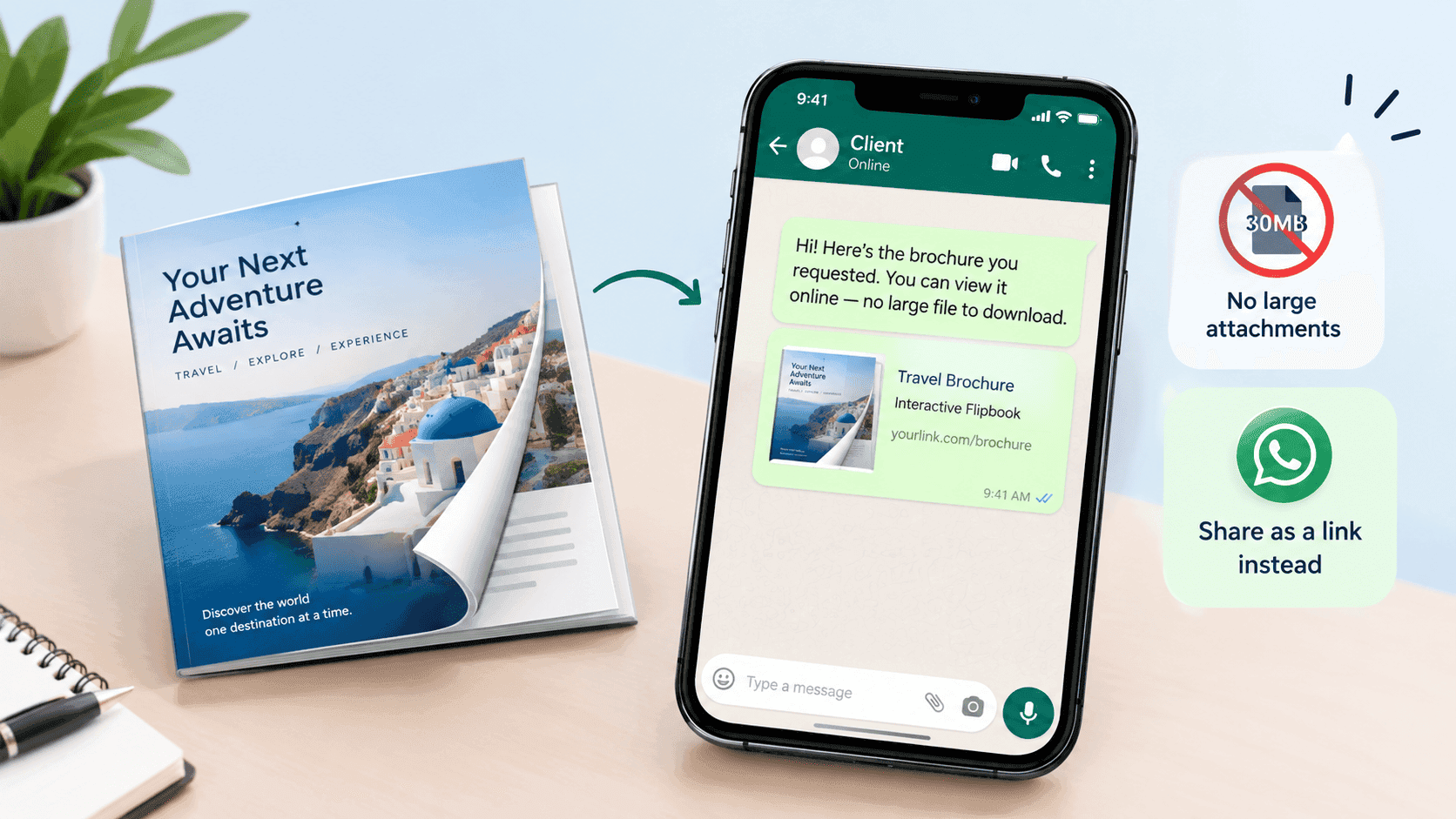
Here's where a lot of otherwise good catalogs die: someone builds a beautiful, fully-linked PDF, then emails it as an attachment or sticks it behind a "Download our catalog" button. Attachments get left in downloads folders. Links get clicked, opened, glanced at, and abandoned the second the file takes eleven seconds to load on mobile data.
A flipbook-style format — where the PDF becomes a page-flipping, zoomable, clickable experience that lives on a web link instead of a downloaded file — solves most of the friction in one move. The reader doesn't need a PDF viewer app. The links inside stay live. And because it's hosted rather than downloaded, you can actually see analytics: who opened it, which page they lingered on, whether they clicked through to a product or bailed on page two.
This is the specific gap ZipFlipbook was built to close — it takes a normal PDF catalog, complete with whatever product links you've already built into it, and turns it into a browser-based flipbook with lead capture and page-by-page analytics baked in, without needing you to touch code or pay for a developer. You upload the PDF, and the shoppable links you set up in step three carry straight through.
Step Five: Test It Like a Buyer, Not a Designer
Once it's built, the temptation is to admire it and hit publish. Don't. Open it on an actual phone, not a resized browser window, and tap every single product link. It's astonishingly common for one or two links in a 40-page catalog to point at the wrong variant, a discontinued product, or nothing at all — usually because the export process mangled a URL somewhere. Nobody catches this by proofreading; you catch it by clicking.
Check load time too. A catalog with fifty high-resolution photos can be gorgeous and also take twelve seconds to load on a mid-tier phone over 4G, at which point a chunk of your audience has already left. Compress images before uploading rather than relying on the platform to do it for you silently and unpredictably.
A Word on Pricing Strategy Inside the Catalog Itself
People are usually surprised how much a buy button changes the reader's behavior. A price alone is just information — the reader files it away and moves on. A price next to a buy button forces a decision, so it's worth thinking about the pricing layout, not just dropping numbers in.
Bundling nearby items on the same spread often outperforms listing them in isolation, because the buyer is comparing rather than just noting. If you sell the mug and also sell a matching saucer, put them together with a slightly discounted bundle link rather than making the reader assemble the set themselves across two different pages. Similarly, if a product has a genuinely premium tier, put the standard version next to it so the premium one benefits by comparison — an old retail trick that works exactly as well in a digital flipbook as it does on a physical shelf.
Don't be afraid to leave a little white space around your highest-margin items either. Crowding a page signals bargain bin; breathing room around a product signals it's worth the price tag next to it.
What to Avoid
Here are a few common mistakes that make a sharp-looking catalog underperform:
Linking every product to the same generic shop page instead of its specific listing — this alone can quietly cut conversions in half, because it adds a search step the buyer didn't ask for.
Overloading each spread with more than four or five products, which turns "browsing" into "scanning," and scanning doesn't convert the way browsing does.
Skipping the mobile check and assuming the desktop version is representative — most catalog traffic these days arrives on a phone, not a laptop, so that's the version that actually matters.
Treating the catalog as a one-time project rather than something you refresh. Seasonal products, sold-out items, and price changes make a catalog stale fast, and a shoppable catalog with a dead link does more damage to trust than a plain PDF ever could, because the reader expected it to work.
The Part People Skip: Getting It In Front of Anyone
No one buys from a catalog they never see. So where's the link actually going? Email. A landing page. An Instagram story. A QR code on packaging for people who already bought once. Pick at least two — don't just bury it in a blog post three clicks deep on your site.
If distribution is the part you're less confident about, it's worth reading through how to get a catalog seen rather than just made — the build is genuinely the easier half of this.
Turn Your PDFs into Lead Generation Machines
Start getting highly-qualified leads from your PDFs and landing pages today. It takes exactly 2 minutes to set up.
No credit card required • Sign up in 10 seconds
Where This Ends Up
None of this requires a developer, a subscription to five different tools, or a redesign of your entire e-commerce setup. It requires clean product data, a layout that respects what you're actually selling, links that go to the right place, and a format that doesn't die in a downloads folder. My friend with the ceramics rebuilt her catalog this way — same photos, same products, but with hotspot links to her Etsy listings and hosted as a flipbook instead of an email attachment. She didn't change what she was selling. She just stopped making people work to buy it.
That's all a shoppable catalog does: it removes the friction between "like" and "buy." Everything else — the layout, the hotspots, the analytics — is just in service of that one thing.